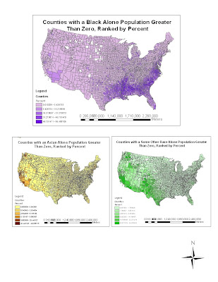
This week got to create our own census map from the U.S. Census Bureau using the 2000 Census. Maybe it wasn't completely from scratch because we had all information in front of us. We just had to put all the information together. We had chance to practice making census maps in the Mapping Census 2000 with ArcGIS on population density, percent change in population, and different change in population. Then we had to create another three maps on different race.
Black Population Map
When I was creating black population map it was kinda confusing because you suppose to use the tutorial step, but swap out few things which were where the problem occurred. I think it because you were trying follow the tutorial and then when one thing was not the same or pre-done for you it confused what you had to do next. What was interested to see the finish product once the map was done. Once finish creating the map it showed there were higher percent of black population counties in southern eastern part of the United States compared to West. This is most likely caused by slavery times in south during early 1800’s.
Asian Population Map
After creating the black population map it was more smooth sailing creating Asian population map. I know from my family history that majority of Vietnamese people after the Vietnam war were placed in California, Vancouver, and Texas that could explain their distribution on the map. Also I think Asian countries are geographically closer to west coast of the United States than the east. The west coast was easier to get to by boat or plane than any other region. Soon after next generation head toward the U.S. they look for family member that already lived in U.S., which was located mostly along the coast.
Some Other Race map
It is hard to define some other race. This depend on the people and their belief how they saw themselves as. It like now on the census form there is check box for some other race because certain people didn’t believe they just belong to one race only. This was widely debate because some people only believe they where half-black, half-white, half-Asian, etc. and they didn’t know where to put themselves in what category. This is why in this map you see wider distribution population than other two maps.
Conclusion
Census map lab was quite frustrating in the beginning. What confused me was that you were doing half of the census tutorial and then you are suppose to join some other direction together, but it didn't work seamlessly as you would hope. I was glad I was not the only one who had gotten stuck doing this lab. I think doing these lab you always need to work with a partner because one or the other will understand it and be able teach the other.
This GIS course was completely different what I thought it would be. It was quite complex and complicated. For the future GIS in my life I am not sure if I would continue. I am not sure if I have the patient creating maps. There are just so much little things you can mess up on and take you so long to figure out you messed up 5 steps ago. It was definitely interesting course. I am glad I learn something new and now have the choice if I want to continue. Since these lab were continuously getting complicated.
No comments:
Post a Comment